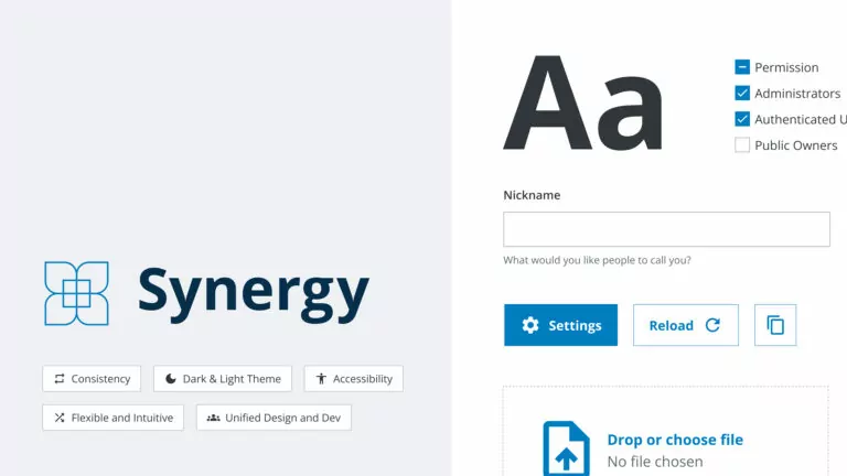
SICK, a global leader in sensor-based applications, teamed up with Virtual Identity to create a new, future-proof design system, “Synergy.” Designed to reduce maintenance and bridge the gap between design and development, Synergy offers a unified platform that boosts creativity and innovation, setting a new standard for user experience.
When SICK, one of the world’s leading solution providers for sensor-based applications, contacted Virtual Identity, they were seeking a relaunch of their design system. Having recognised as key to a coherent user experience across all platforms a few years before, their first-generation UI library suffered under heavy maintenance efforts, low flexibility and lacked acceptance. Over time, this made it harder to serve stakeholder needs, while gaps to existing style guides increased. Having recognised that, SICK decided to start over with a new design system from scratch.
A new Vision for SICK’s Design System
SICK searched for an experienced partner for this task, to avoid the pitfalls of the first generation. A main promise made to the stakeholders was to keep maintenance efforts low. This would enable the design system team to focus on researching their users’ needs and to develop according to their requirements. Here, Timothy Burk, Head of UX and UI Services, SICK AG, saw the biggest potential to establish a future design system: “I must converse with users, comprehend their needs.”
SICK found this experienced partner in Virtual Identity. While discussing their collaboration, SICK and Virtual Identity quickly found common ground with basing the future design system on an existing open-source library to utilise build-in features and upcoming community updates. With a proprietary solution, VI unlocked the Gordian knot to profit from these updates, while allowing unlimited customisation at the same time. This made the client’s vision come true, as it reduced development, without compromising on quality and customisability at the same time.
Nevertheless, even by basing it on a pre-existing library, a functioning design system requires precise adaption to future usage fields and the company’s brand identity. For this highly collaborative task, SICK and Virtual Identity formed a multi-disciplinary team with experts from both companies. “Herein lies the essence of our success: a collective effort where expertise is shared, ideas exchanged, and solutions forged collaboratively”, summarises Timothy Burk.
Why Design Systems?
Regarding their digital customer touch points, most companies seek the same: A unified brand experience for their customers, which works seamlessly between platforms, is accessible, responsive and intuitive to the user. Other concerns, such as the growing requirements regarding web accessibility and SEO-driven concerns for high performing and adaptable websites are also standard. All these needs can be met with a well-established, thoroughly set-up design system. Further, in an internal perspective, utilising a design system speeds up development and frees up internal resources in favour of strategic, value adding work.
Bridging the Gap between Design and Development
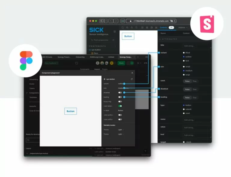
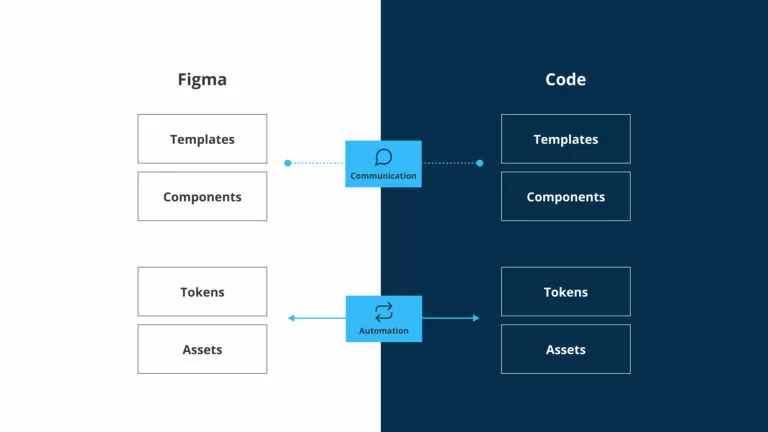
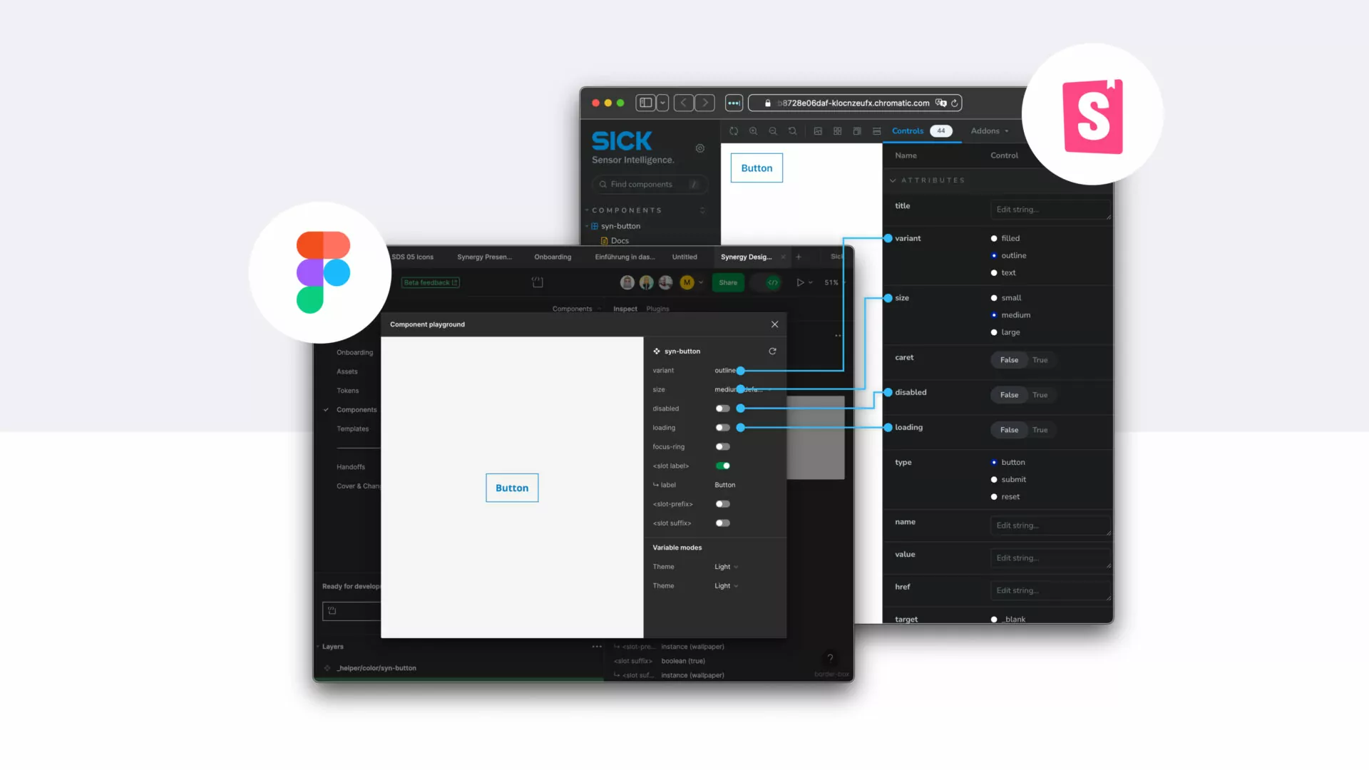
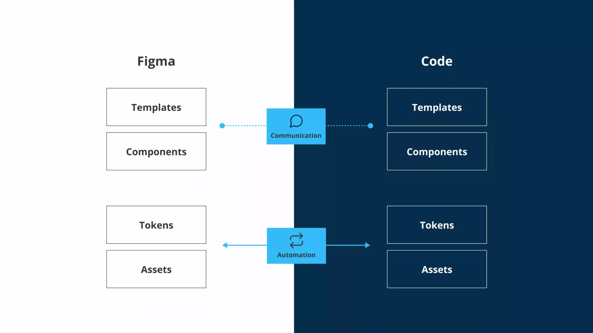
As the design system’s customers are highly professional designers and developers, close collaboration in building a system that works for the web and Figma alike was crucial. Following VI’s approach of building “Unified Design Systems”, the team started with creating a shared product vision, establishing a common language between designers and developers as well as shared processes. This allowed value-adding, simultaneous collaboration of developers and designers.
Traditional friction between development and design turned from conflict to enriching exchange and provided unmatched quality and synergies on both sides. In Timothy Burk’s words, this “transcended mere technical integration”, made possible by “a shared purpose and unified vision”.
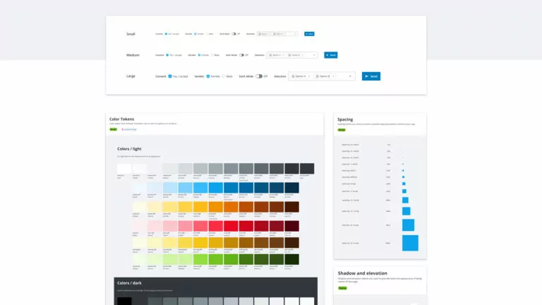
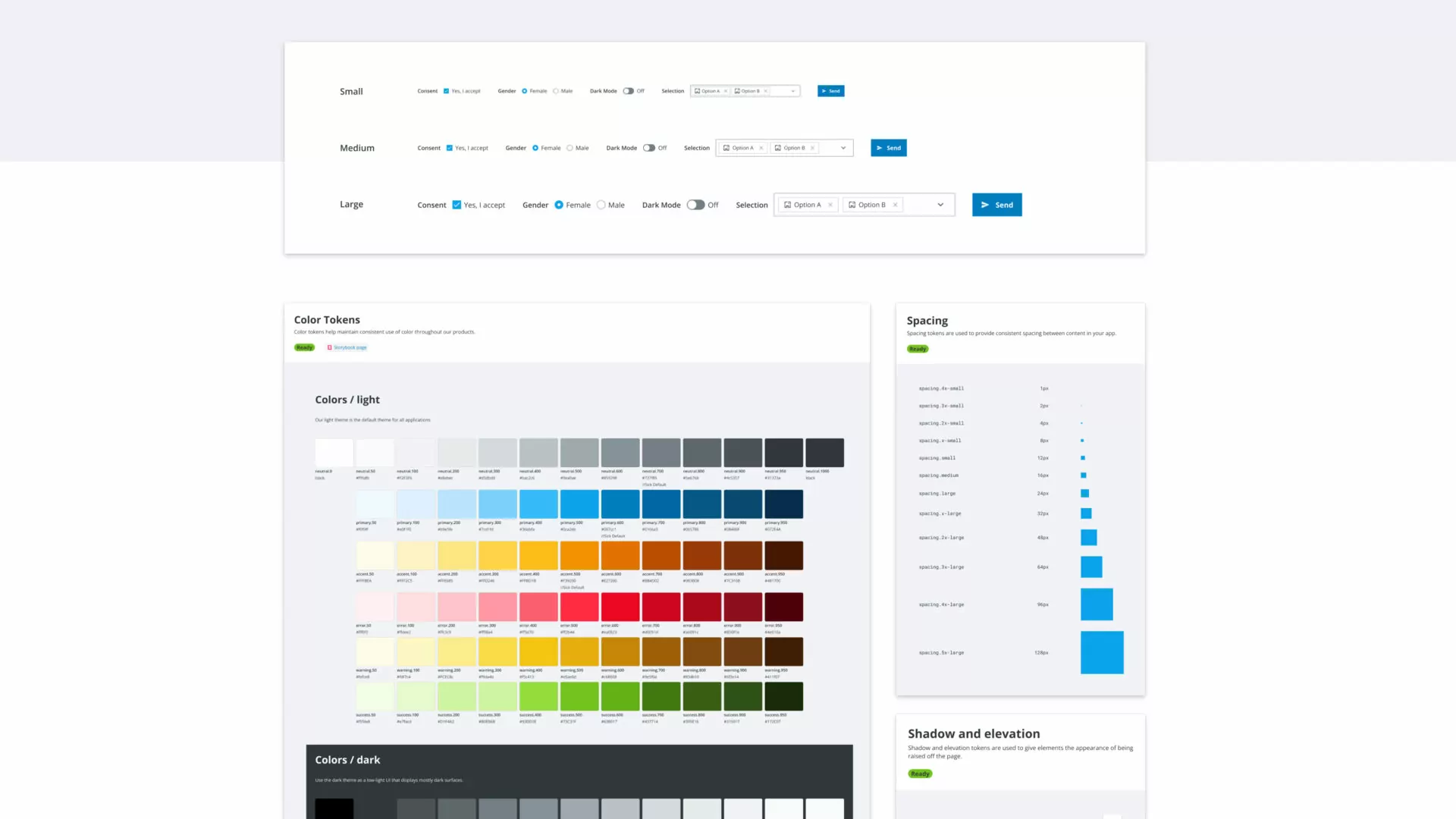
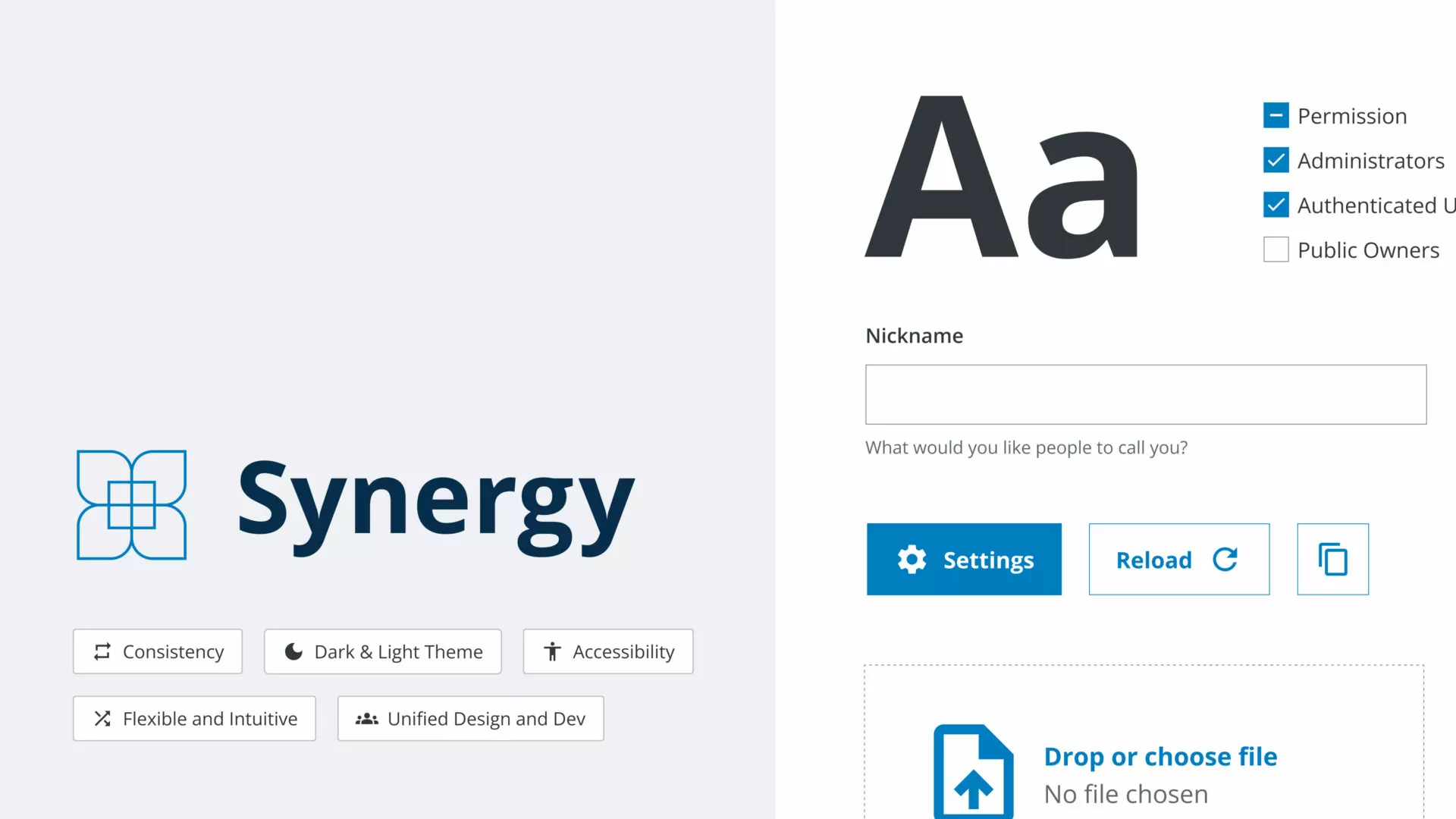
As a result, the design system, aptly named Synergy, offers a company-wide shared language via design tokens, highly flexible components for individual needs and inspiring templates to quickly build up applications – all of that being usable for designers and developers in a similar manner. Currently, Synergy is being rolled out company-wide and starts to show its full potential. Products using Synergy offer a consistent experience for users, while efforts in development are reduced and funnelled into value-adding, innovative work.
The results, knowledge and experiences gained from this work will form the basis for future digital initiatives and support SICK in further expanding its position as innovation leader in the industry.
You would rather listen to the case than read it?
No problem. Listen now to an AI-powered conversation explaining our case, created using Google’s NotebookLM:
Find out more about our AI Services here or get in touch with us.


