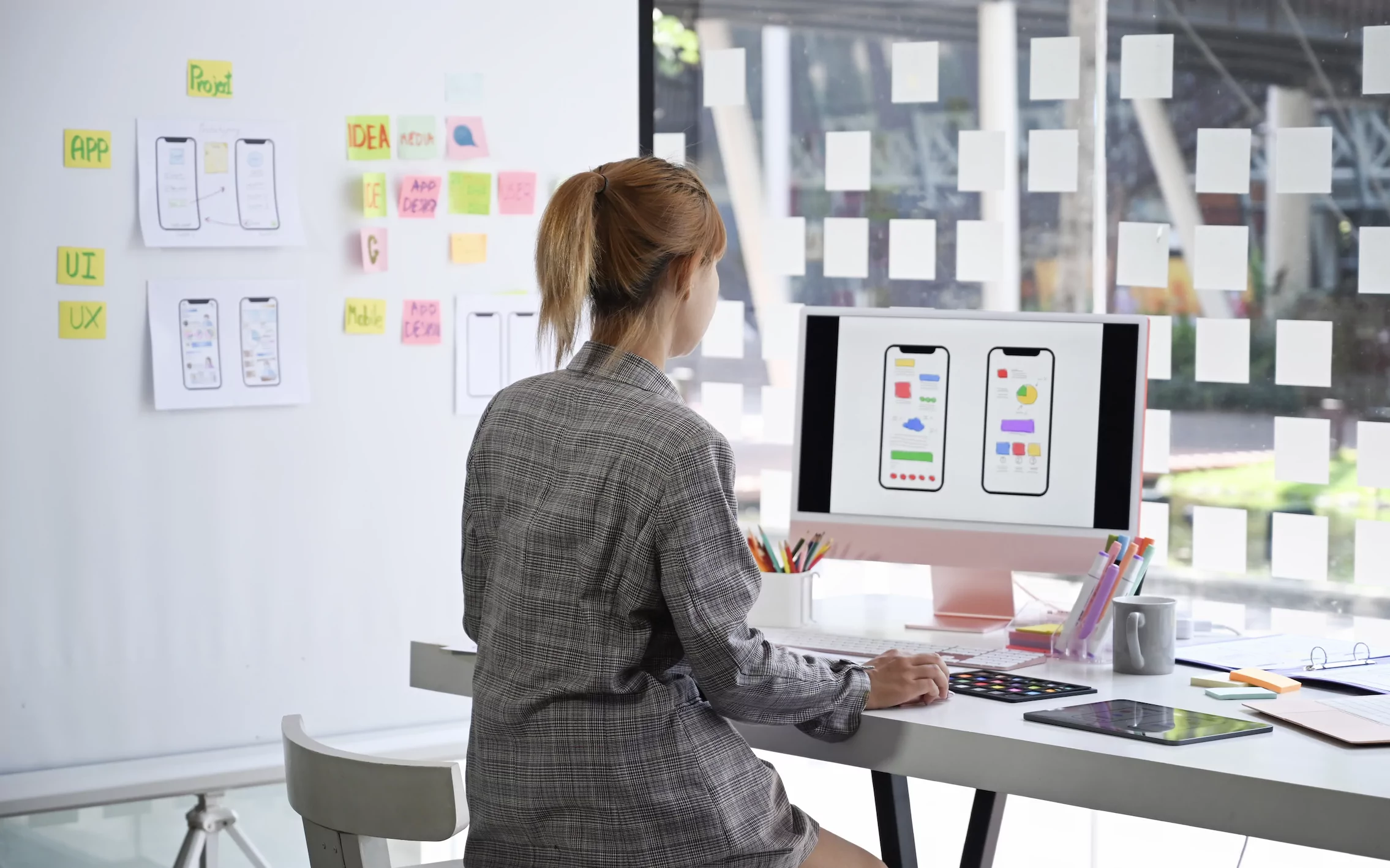
Starting as a UI designer, Lume transitioned more and more into the UX side of things. Today they are excelling in both, claiming it’s a great way of understanding a project inside out.
My interest was always in visual arts, everything multimedia related. My uni course was called Audio Visual and Multimedia and in each semester, there was a focus on design. We could go into production, video, we could go into audio. From there I was lost for a year and needed to take a step back. Then I saw an opportunity for going into web design.
When VI reached out to me, I wasn’t sure what they were doing. In the very first meeting, I quickly understood they have an approach I’ve never seen, it was a human approach in how to connect to people. I felt I could be honest about what I’m saying, I didn’t need to put on a professional front. There was this release of pressure from everything.
"That was the transition I got on early. And that's my workflow now – I live in both worlds."
I started in UI, but in my very first interview I had stated that I was curious to see how UX worked too. I spent six months doing UI design, which is basically visual design. Everything that visually appears on the screen needs to be connected to the image of the brand. That’s why UX instead takes care of the overall concept. Everything is connected to why we’re developing something, for what people, with what intention: that’s what I wanted to learn. A team member immediately supported me, saying: “You are going to start this project. You’re starting from scratch. You’re going to be the UX designer and the UI designer at the same time. And I will guide you through the process.” That was the transitioning I got on early. And that’s my workflow now – I live in both worlds.
I understand it can be overwhelming for one person to have all these responsibilities from the concept phase and the visual design at the same time. If you’re doing concept, you shouldn’t really be focusing on how things are going to look. That’s at least the official view on the separation of UX and UI design. I understand people saying, you shouldn’t mix both because it’s going to taint your brain. But at the same time, it gives you a unique overview because if you did the concept, you have a better idea on how it will look like later in the process. I can be the devil’s advocate for both sides.
"This is how I feel about UI design: it's like being the translator of the mind."
I always say UX is the brain and UI is the body. For the brain part, you’re focused on the functionality of it: Why is this button here? What do users feel when they see this? You must level emotions and logic like you do in real life. Once you go into the visuality, it’s not only connected to the concept, because people have this misconception about visual designers just caring about aesthetics. Yes, the aesthetic is super important, but it takes a very smart person to look at a concept and visually understand it without having been there. That’s a massive skill that only a few people have – to be able to look at something conceptually and translate it into the visual. This is how I feel about UI design: it’s like being the translator of the mind.
Every job can be summarised as something stupid: “UI designers are just placing a button there.” But UI designers are super underestimated as visual people. It’s like looking at a black canvas. People say, my son could have done this. Yeah, but they didn’t, so what’s the point? They couldn’t even, because there is always a concept behind the image. Someone needs to think about it before it appears. It’s always interesting to me when people use visuality to undermine rationality: it takes a lot of brains to be intentionally visual. Only if you understand the visual reasoning, you can move into the technical and profound side of visual design. Who are my users, what do they need? And if you then also did the UX research, you know where the user is coming from, because you interviewed them. I get a better idea of their frustration, sadness, irritation about why the need the button there. And when I’m doing the visual UI, I can be more empathic and make their lives a little easier.
"I’m in this experimental phase where I want to see both sides."
But I am not blind as to how it’s about users buying stuff. The word capitalism just came up, right? I understand we need to make money. Do I agree with how we make money as a society? Not so much. But regarding my profession and how you can ethically look at that, UX and UI are mainly focused on the user. It’s still about money, but it’s really connected to a service the users need. That especially comes into play with designing community platforms or counseling platforms for example: if users have issues, they can talk about it in a forum anonymously.
I hear a lot of people say, I prefer UX design, or I prefer UI design. I understand why there’s this need of advertising one job or the other. But I’m in this experimental phase where I want to see both sides. I’m not focused on choosing one side yet, but if three months from now I’m tired of doing UX, maybe I’ll say: This was fun, right? Once I understand what I’m doing, I’m already over it. Once there’s nothing else to learn? I’ll jump out to try something new. And I could only do that because my colleagues have an idea of who I am.

